Home improvement shows are full of examples of folks having their home remodeled to pretty things up and better maximize the space available to them. I personally love watching the before and after transformation and the look on the faces of the home owners during the unveil. I had a similar reaction when my UI team first shared a sneak peek of Netskope’s new and improved user interface.
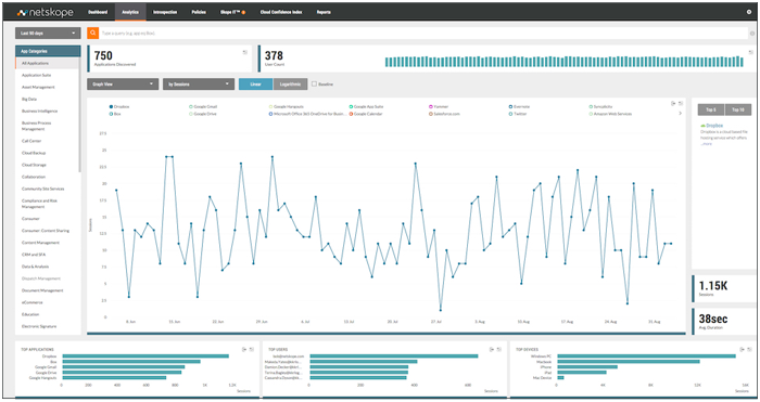
Here is a run down of some of the UI changes that come with the recent 3.0 update to the Netskope Active Platform.
First, there is the change to a flat design when it comes to the overall look and feel of the UI. The minimalist approach applied to colors, buttons, and fonts presents a more pleasing experience to anyone operating the Netskope console.
We’ve improved our top navigation bar to make it easier to find what you need. You’ll find your App and User Analytics under the Analytics tab, your Events and Alerts together with SkopeIT under the SkopeIT tab, and your Settings, Account, and Logout under the gear at the top right. All of the sub-navigation screens formerly on the left hand side of your screen have been relocated to the top sub-navigation bar to make them easier to see.
We’ve made our workflows a little more user-friendly. For example, our policy wizard tells you how many steps you have in your policy configuration and keeps you on track. Our easy-to-see toggles in the settings screens help you see what you’ve configured. And we’ve beefed up our “info” icon to give you the answers you need, when you need them.
Netskope customers received the UI improvements as part of the 3.0 update yesterday. 3.0 is also loaded with feature enhancements and you can learn more about the details of the 3.0 release by referencing the release notes in your tenant.
You can also learn about some of the key enhancements in 3.0 by watching a couple of our new product demos.
Learn more about our Cloud Access Security Broker (CASB) solutions for safe cloud enablement.


 Atrás
Atrás 














 Lea el blog